My dear agent Janet Reid has been running a contest on her site that attracted 416 manuscript entries. Based on Janet's amusing but increasingly distraught posts on the subject, it seems some people who submitted manuscripts are unclear on the standard format. There's plenty of information around the net about ms formats, but to make it simple I thought I'd put my own ms template online for anyone to copy if they want.
This is the document format I've used to write four novels. No one's ever complained to me about it. In fact, I have a reputation amongst my editors for delivering clean manuscripts, of which the formatting is a small part, so you're probably safe to use this. This is precisely the file as I submitted it for The Pericles Commission, minus the final 350 pages. I left in some opening paragraphs so you can see the paragraph style format.
This link will open a read-only copy in another browser window:
Gary's standard ms format
A few comments:
To use, download the document and change the words. What could be simpler? Don't fiddle with the formatting. When you stare at hundreds of pages every day, the last thing you want is for someone to get creative with formatting.
A manuscript is a tool for writers, like a hammer is a tool for carpenters. When you pick up a hammer, you'd like the hammerhead and the handle to be in the same place, every time, no matter what the quality of the hammer may be. The same logic applies to manuscripts.
It would probably be a good idea to change my name for yours, unless you'd like me to receive your royalty cheques. The name in the top left is your real name; the name under the title is what you want to have appear on the cover.
Don't try to make your ms look like a book. The publisher has people who'll do that for you.
Word count in the top right of the first page need only be to the nearest thousand. It's only to get a feel for page count. The editor really doesn't care if there are precisely 97,354.64 words in your document. By the time you've finished with the edits, that number will have changed by a few thousand words anyway.
Probably the most important things are the double spacing and the very wide margins. Since publishing is still firmly embedded in the Stone Age, the editor will print your ms, on real paper, and the copyeditor will scribble all over it, probably in green pencil. Those margins and the space between the lines are where the copyeditor will save your life by fixing the errors. It's normal for Copyeditor to rewrite entire sentences in the double-space gaps. If the editor is your doctor, the copy editor is your head nurse. Don't make it hard for the nurse to look after you.
New paragraphs begin with a significant indent. Unless you want the acquiring editor to get a headache while reading your submission.
Start new chapters half a page down. The copyeditor will use the top half to write printer instructions in red pencil.
Times New Roman is the One True Font. I'm sure no one would ding you for using Georgia, but since every professional in publishing is happy to use Times New Roman, and every writing system supports it, why would you use anything else?
Don't forget to change the top left of the header for your surname and title. This is essential so that, when the editor prints your ms and three others, and then drops all four in the elevator, they have a fighting chance of reassembling the right pages in the right manuscripts. It would be unfortunate if the romantic comedy, the techno-thriller and the zombie horror got mixed up.
You'll notice I created a custom style called Story Paragraph. I honestly couldn't tell you what's in it exactly because I created it five years ago and haven't changed it since. Just apply that style to every paragraph, or use the copy format button, which is what I normally do.

Greek and Roman arches
The Greeks had no concept of an arch as we know it. The Greek temple design is incredibly elegant, and one of the most copied building designs to this day, but it amounts to piling one thing directly on top of another.
They did have an arc they could build, of a type called a corbel arch. Here's an example:

This is the famous Lion Gate at Mycenae. I took this picture myself, many years ago. The stones above the lintel have been placed to overlap a bit, one above another, so that you get the illusion of an arch in negative. The stones would stay there even if the relief of two lions didn't fill the gap. By classical times, even the corbel arch had pretty much disappeared from Greek designs.
It remained to the Romans to come up with what we call the Roman Arch. I've rarely seen a better example of a Roman arch than this fine example:
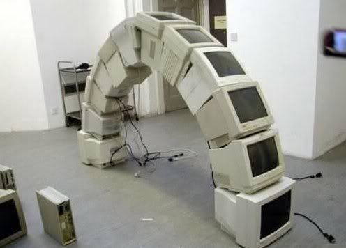
As you can see, the whole thing would collapse in an instant if gravity wasn't pulling down on every block. Or in this case, on every computer monitor. It relies on shaping every block exactly for its position. The topmost block (monitor) is hugely important and is called the keystone. It's really very clever. The downside is nothing can stay up until everything's in place. So they'd build wooden supports beneath and then knock them away after the keystone was in.
The one thing both Greek and Roman architecture have in common is they both use gravity as glue.
Moderation temporarily turned on for comments
Spammers are currently assaulting my blog with a lot of comment spam. I've deleted it all (I hope). I'm sorry to say I must turn on comment moderation until these cretins go away.
I've noticed a significant surge in the last few months of comment spammers who are clearly real people rather than bots. They write something that looks relevant to the post, in the hope that I won't notice them, and then include a link to their crappy, virus-ridden sink hole of a web site. Since they're real people, none of the usual anti-spam systems block them.
I really, really, don't want to turn moderation on, because I know many people don't like it. But alas I must; the only alternative is to turn off comments entirely. Please bear with me and we'll see what happens.
The Wedding

Anneke is an excellent writer, and as you can probably tell she's an excellent writer in Dutch, that being her native language. De Bruiloft means The Wedding.
What's remarkable is that she also writes fiction in English, and critiques in her second language. Anneke's been one of my beta readers since long before The Pericles Commission was a gleam in any editor's eye (which means she knows what happens in book 3). She's so good at critiques that I've been prodding her for ages to take up manuscript assessment as a paid job.
Fortunately Anneke ignored me and instead wrote The Wedding, and I couldn't be happier that she's in the print that her talent deserves.
The books that changed me
The Sydney Morning Herald's Sunday edition runs a regular piece called The Books That Changed Me. Each week, an author nominates five books they think important, and the reasons why.
I'm very happy and privileged to say that this week it was my turn to give it a go. It's part of the print edition but they also put it online. If you'd like to see what I picked for the five books that changed me, it's all over at the Sydney Morning Herald.
(My author photo is right next to an author shot of Colleen McCullough...OMG)
Drink like a Greek: wine cups
Ancient wine was quite unlike the modern stuff. To start with, they added spices, such as fenugreek, which these days you're more likely to find in a curry. They also added seawater, for a very good reason. In a world without sulphur, salt makes the next best preservative.
Wine was always drunk with water mixed in. No exceptions, not ever. To drink wine neat was the mark of the worst sort of dissolute barbarian. The usual ratio was three water to one wine. Since water filtration plants hadn't been invented yet, the practice might have begun so the alcohol could kill any bugs in the water. The water and wine was mixed together in a large jar called a krater, and then served out into cups.
Wine at a party was served in a very wide, very flat cup called a kylix. Here's one at the Metropolitan in New York:

Yes, the decoration on the outside is a naked woman drinking from a kylix. Some of the decorations on these things would be rated XXX. Speaking of which, here's a decoration on the inside of a cup. This is what you'd see after you've drunk the wine:


In The Ionia Sanction at one point I have Nico at a Persian party where he's given a rhyton to drink from in the shape of a boar.
Wine was always drunk with water mixed in. No exceptions, not ever. To drink wine neat was the mark of the worst sort of dissolute barbarian. The usual ratio was three water to one wine. Since water filtration plants hadn't been invented yet, the practice might have begun so the alcohol could kill any bugs in the water. The water and wine was mixed together in a large jar called a krater, and then served out into cups.
Wine at a party was served in a very wide, very flat cup called a kylix. Here's one at the Metropolitan in New York:

Yes, the decoration on the outside is a naked woman drinking from a kylix. Some of the decorations on these things would be rated XXX. Speaking of which, here's a decoration on the inside of a cup. This is what you'd see after you've drunk the wine:

The lady is playing a drinking game called kottabos. That's why she's holding her cup in that funny way. Here are the rules for kottabos:
- Drink your wine to the dregs.
- Hold cup as per lady in picture.
- Throw the dregs at the nearest wall.
Winners are judged for the most interesting patterns on the host's walls, or possibly the furniture or the fellow guests if someone's a bad shot.
The other, more unusual cup for alcohol, is something much more associated with Vikings, but in fact comes from Persia. The Greeks called it a rhyton, which is also the English word. It's a cup in the shape of a horn:

These things were always made in the shape of an animal or some similar subject. These are at the Getty Villa in L.A., as is this lion:

In The Ionia Sanction at one point I have Nico at a Persian party where he's given a rhyton to drink from in the shape of a boar.
Subscribe to:
Posts (Atom)